
Creditas
Review Screen
How to simplify the credit loan experience for
returning users and encourage them to close the deal

My roles
Design Strategy + Discovery + Information Architecture + User Flow + User Research + Wireframes + Prototyping + Usability Testing
Overview
Creditas is a fintech and digital platform that offers secured credit and operates with four main products: secured loan, secured vehicle loan, private payroll loan, and vehicle finance.
Our challenge is to improve the returning customer experience, which is the company’s strategic focus.
Context
The credit application flow was structured into three steps and used for both new and returning customers. This lack of differentiation forced returning users to restart the entire process, creating frustration and increased drop-off rates.
Goals
1 – Simplify the loan application process for returning clients, minimize the number of steps required in our lead form.
2 – Improve conversion rates and make it easier for returning users to finish their loan application.
Solution
A review information screen simplified to clients who already input their informations and want to reactive the credit request.
Strategy
When returning users want to finish their loan application quickly, going through the entire three-step form again can cause frustration and drop-offs.
To solve this, we proposed a review screen showing the information they had already filled out, so they could simply confirm and move on to the analysis step.
This flow reduces effort, shortens the process, and helps lower abandonment rates.
Our standard lead form is step by step being composed of three steps:
1 – Credit value, name and mail (4 inputs)
2 – Personal information (+10 inputs)
3 – Garantee information (+10 inputs)
Being able to consolidate all the information into a single screen would make the experience for returning clients much easier, as it eliminates unnecessary steps in the application process.
Design Process
Research
To validate our hypothesis, we started a round of research with our users, being devided into:
– Customer Jouney
– Survey - quantitative: Understand customer needs and goals
– User Interviews - qualitative: Exploring what motivates customers to apply for a loan
Customer Journey
I created a customer journey map to visualize the entire loan request process, from the user’s first interaction to the credit analysis stage.
This helped us identify the key moments of friction, the internal teams involved, and the main gaps and opportunities across the experience.
The journey became a shared tool for aligning Product, Design, and Operations and a guide to focus our next improvements.


Survey
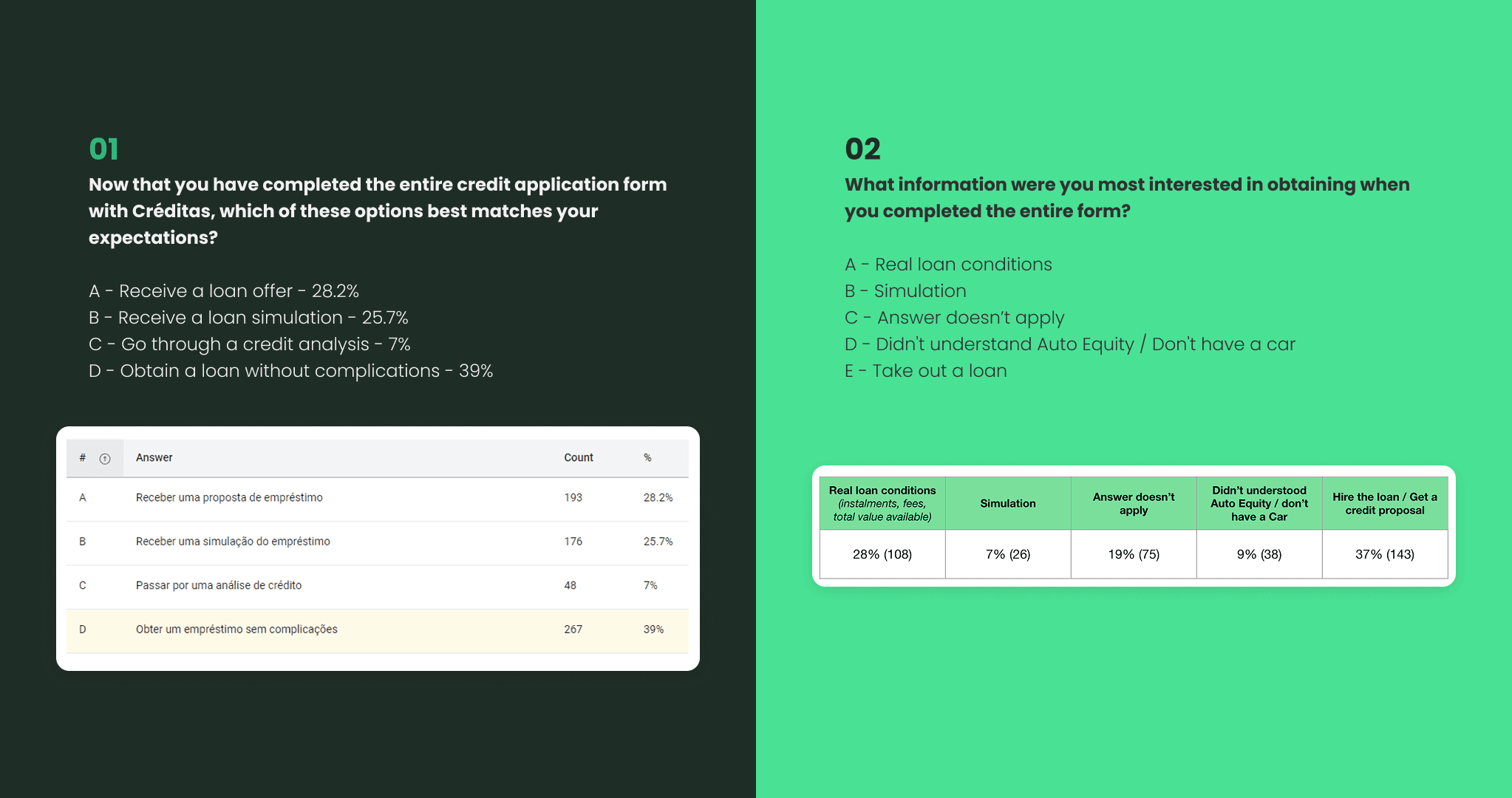
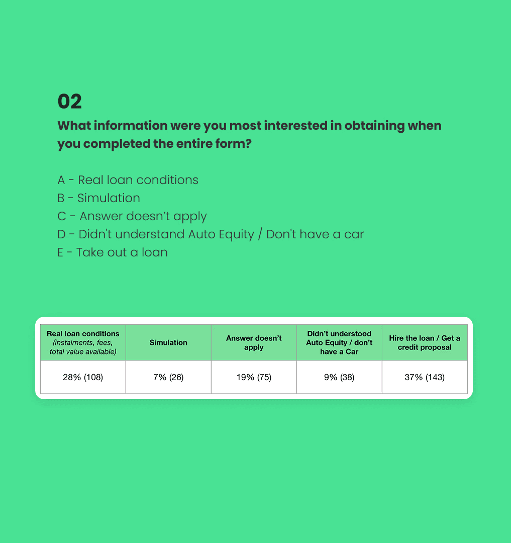
The survey was our first step to understand the customers and the job to be done when accessing the lead form.
It was validated via Hotjar, which appeared after the customer completed the form for the first time. It was divided into two questions:

User interview
I conducted several interviews with customers to understand their motivation for seeking and simulating a credit application, focusing primarily on the reason for their return.
We interviewed users who had started the loan application process but didn’t complete it.

User Flow

Architecture Interface

First prototypes
I started with the simplest version: no visual elements, just an outlined input field.
After a few testing rounds, I added an icon and changed the input style, since users didn’t perceive it as editable.
Finally, in v03, I added an illustration to bring more life to the screen and improved both accessibility and the slider experience.

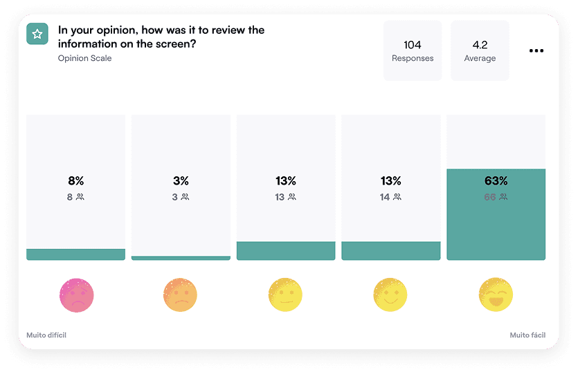
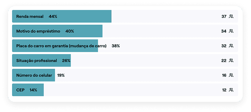
Usability tests
I validated the flow via Maze, gathering some insights for improving the experience.
The majority (63%) of users feel more comfortable and encouraged when returning to the flow with the review screen.
Final Version
After analyzing the usability test results, I refined the return screen, removing information that users rarely needed to edit.
I also started exploring ways to make the experience feel more human and consistent with the brand identity.

Implementation Process
A/B Test
We started with an A/B test, comparing the current version (control) with the new experience (variant).
The goal was to measure the direct impact of these changes on conversion rates and overall user experience.
Target users
The customer base for both test groups (control and variant) was composed exclusively of pre-qualified leads.
These leads had already passed the initial eligibility criteria and had a pre-approved amount, which helped ensure consistent results and relevance to our target users.
Launch strategy
The new experience was rolled out gradually, starting with a smaller group of leads.
This approach allowed us to closely monitor the results and make adjustments before a full-scale implementation.
In July, we launched the A/B test exclusively for the car-backed loan journey.
By September, the test was expanded to include the home-backed loan journey, and in November, the new experience was rolled out to 100% of the user base.
Results
Hypothesis validation
Hypothesis:
Introducing a review screen could increase the conversion rate of pre-qualified leads by reducing drop-offs in the intermediate steps of the lead form.
Validation:
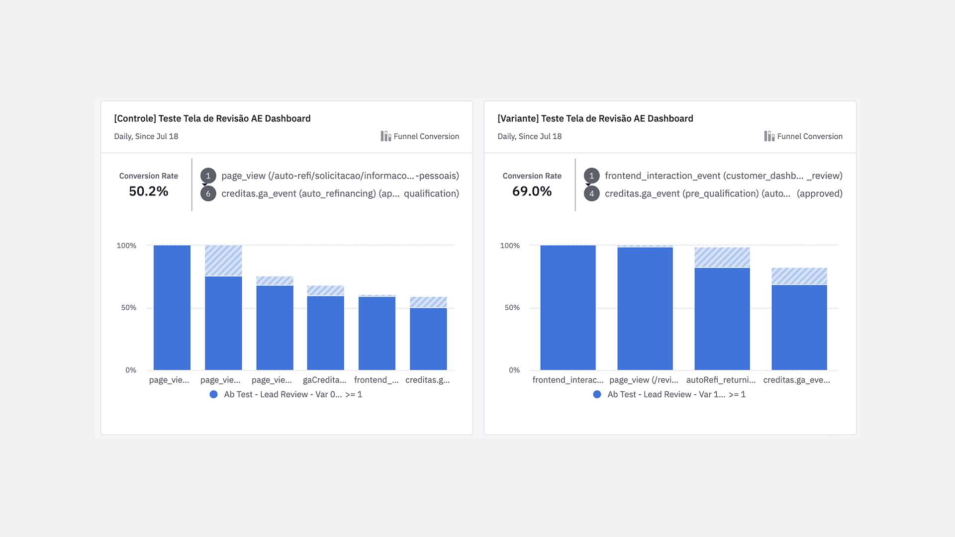
The results showed a significant increase in the conversion rate of the variant compared to the control, confirming the hypothesis that the review screen had a positive impact on lead conversion.
Lead conversion
July
Base: Pre-qualified leads
Control group: 50.2% conversion rate
Variant: 69.0% conversion rate
Increase: +18.8 percentage points (a proportional increase of 37.4%)
Lead conversion
November
Base: Pre-qualified leads
Control group: 50.2% conversion rate
Variant: 69.0% conversion rate
Increase: +18.8 percentage points (a proportional increase of 37.4%)

Conversion Time Reduction
In the control group, leads took between 5 and 13 minutes to complete the process, with an average conversion time of approximately 7 minutes.
In the variant, most leads completed the process in less than one minute, showing a significant reduction in conversion time compared to the control group.

Learnings
About the problem
The increase in conversion rate and the reduction in conversion time validated the effectiveness of the new experience.
The results also reinforced the importance of simplifying critical steps in the flow to improve overall performance.
Finally, the insight about the difference in conversion time highlighted the need to keep optimizing flows to minimize friction and create more efficient journeys.
Whats good?
Partnership with the engineering team;
The discovery process;
Overcoming the challenge of working with marketing.
Future Improvements
Present to stakeholders only when the content is validated;
Implement a chatbot for new users, bringing the experience closer to WhatsApp.
